
‘You are designing for people the way you would like them to be, not for the way they really are.’
Norman, 2013
Digital accessibility means that all digital content or digital environments are designed to be inclusive and accessible for all learners/users regardless of their abilities. Ensuring that digital content is accessible involves thinking about the learner’s or user’s profile so that the design caters for their needs. Some key considerations include inclusive fonts, providing alternative formats, creating screen reader friendly or keyboard friendly content, etc.
What is digital accessibility?
Digital accessibility means that digital content, e.g., the content on our Canvas modules, is designed in such a way so that it’s usable by everyone regardless of their abilities.
When we asked several members of staff to tell us what accessibility means to them, we recorded the following responses:
‘remove barriers that prevent learners from participating’
‘everyone can access and interact with content’
‘can be used anywhere by people of varying abilities’
‘being mindful of formatting, layout, images etc and how that may cause barriers’
In this 5-minute video, Jennifer Wright, Lecturer in Education (PE) and Sport, shares her thoughts on the importance of digital accessibility and experience with making her digital content more accessible for all learners.
Key questions to ask
Based on the Web Accessibility Initiative (WAI, 2016), determining whether our content is accessible means that we should ask ourselves the following set of questions:
- Can all learners equally perceive the content?
- Can all learners equally understand the content?
- Can all learners equally navigate and interact with the content and tools?
- Can all learners ‘contribute equally without barriers’?
If the answer to any of the preceding questions is no, then that could mean some learners will struggle to process or interact with the content. Therefore, we must find ways to keep evaluating and improving the accessibility of our digital content.
The learner’s profile
Before we create our online materials, we should think about our learners’ profiles. This will help us reflect on how various learners take in and process the information on their screens.
Suppose, for example, a Canvas page is too crowded and cluttered with information lacking clear structure and signposting. The page has no logical heading structure and does not provide podcast transcripts. As a result, learners become confused and struggle to understand what is expected of them or what they need to do next based on the information given. A screen reader user might struggle to navigate the page since it lacks logical heading structure whereas a non native English speaker might find it harder to listen to the podcast.
In other words, by considering our learners’ profiles, we can ensure that the content we design is tailored to meet everyone’s needs and capabilities.
3 main characteristics
In a recent talk on cognitive accessibility and inclusive design, Jamie Knight (2018), a web developer and speaker, suggests that we could think of our learners as having three main characteristics:
- Diverse, i.e. different ethnic backgrounds, language users, neurodiverse
- Distracted, i.e. employment, housing issues, loans, family/baby, moving fast)
- Impaired, i.e. visual, hearing, motor, cognitive (learning)
If you would like to learn more about digital accessibility and inclusive design, you are encouraged to watch Cognitive Accessibility – Jamie Knight & Lion (Accessibility London, 2018).
Making accessible content using THRIVES
It might seem like a lot to keep in mind when creating your online materials. Fortunately, the Centre for Educational Development (CED) at Queen’s University Belfast has created a short acronym, THRIVES, to help us remember seven key accessibility guidelines.
Let’s break down what each letter stands for:
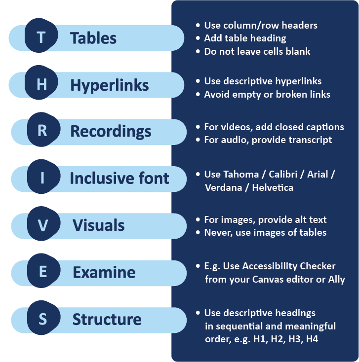
The following headings provide additional information about each letter in the THRIVES acronym. Explore each heading to learn more about its key considerations.
T for Tables
- Keep tables simple and mainly for data
- Avoid adding long text, videos or images to tables
- Provide table heading
- Specify column/row headers
- Avoid leaving table cells blank
- This is because a screen reader will interpret a blank cell as a sign that the table has ended.
Navigate to [add link to Canvas page] to look at examples of accessible and inaccessible tables in Canvas.
H for Hyperlinks
- Use descriptive links that convey information about the content the user will be directed to when they click on the link
- Make sure hyperlinks are meaningful
- i.e., Avoid using URLs as screen readers will read character by character (w-w-w-dot-h-t-t-p-colon…)
- Do not underline text unless it is a hyperlink, i.e. underlined text signifies a hyperlink, so if you want to give emphasis, you should use bold text instead.
Navigate to [add link to Canvas page] to look at examples of accessible and inaccessible use of hyperlinks in Canvas.
R for Recordings
- Ensure video and audio recordings have closed captions or/and a transcript.
Remember that closed captions are automatically generated and added to all Panopto recordings unless a Panopto recording is created without primary sound.
Navigate to [add link to Canvas page] to look at examples of accessible and inaccessible use of video/audio recordings in Canvas.
I for Inclusive font
- An accessible font is a font/typeface that will make reading as easy and enjoyable as possible without slowing down the reader.
- Whether a typeface is accessible depends on the following attributes: height, width of each character, spacing, alignment on lines, etc.
- You are encouraged to use Calibri, Tahoma, Arial, Verdana and Helvetica.
- *The University’s standard font is Calibri.
- Encourage learners to use the Immersive Reader (Canvas) to configure text size, spacing, theme/background colour and font based on their preference.
You can find more information on how to use the Immersive Reader on More accessibility tools.
V for Visuals
- Provide alternative text for images or in-text descriptions if longer than 120 characters.
- If an image is decorative, mark it as decorative.
- If an image is purely decorative, think about whether the image adds to the learning experience. If not, consider removing the image.
- Use icons as visual aids to help provide signposting. Make sure you use those icons consistently.
- Use banners as visual aids to help provide signposting. Navigate to [add link to asset folder Sharepoint] to access and download the banners from the Learning and Teaching Enhancement online library.
E for Examine
- For Canvas sites, use Ally and Canvas Accessibility Checker to evaluate the accessibility of content.
- Canvas Accessibility Checker will flag any accessibility issues on the page and prompt you to resolve them.
You can find more information on how to use Ally and Canvas Accessibility Checker on More accessibility tools and Anthology Ally.
S for Structure
- Use logical heading structure
- Why are heading levels so important?
- Heading levels have a semantic role built into them influencing how screen readers read these.
- A nicely structured page will help screen reader users easily navigate the page.
- Always start at H1 working your way to H6 without skipping any heading levels. Canvas allows the use of H1 to H4 only.
- Use instructional language to signpost, i.e. guide the learner through the page content.